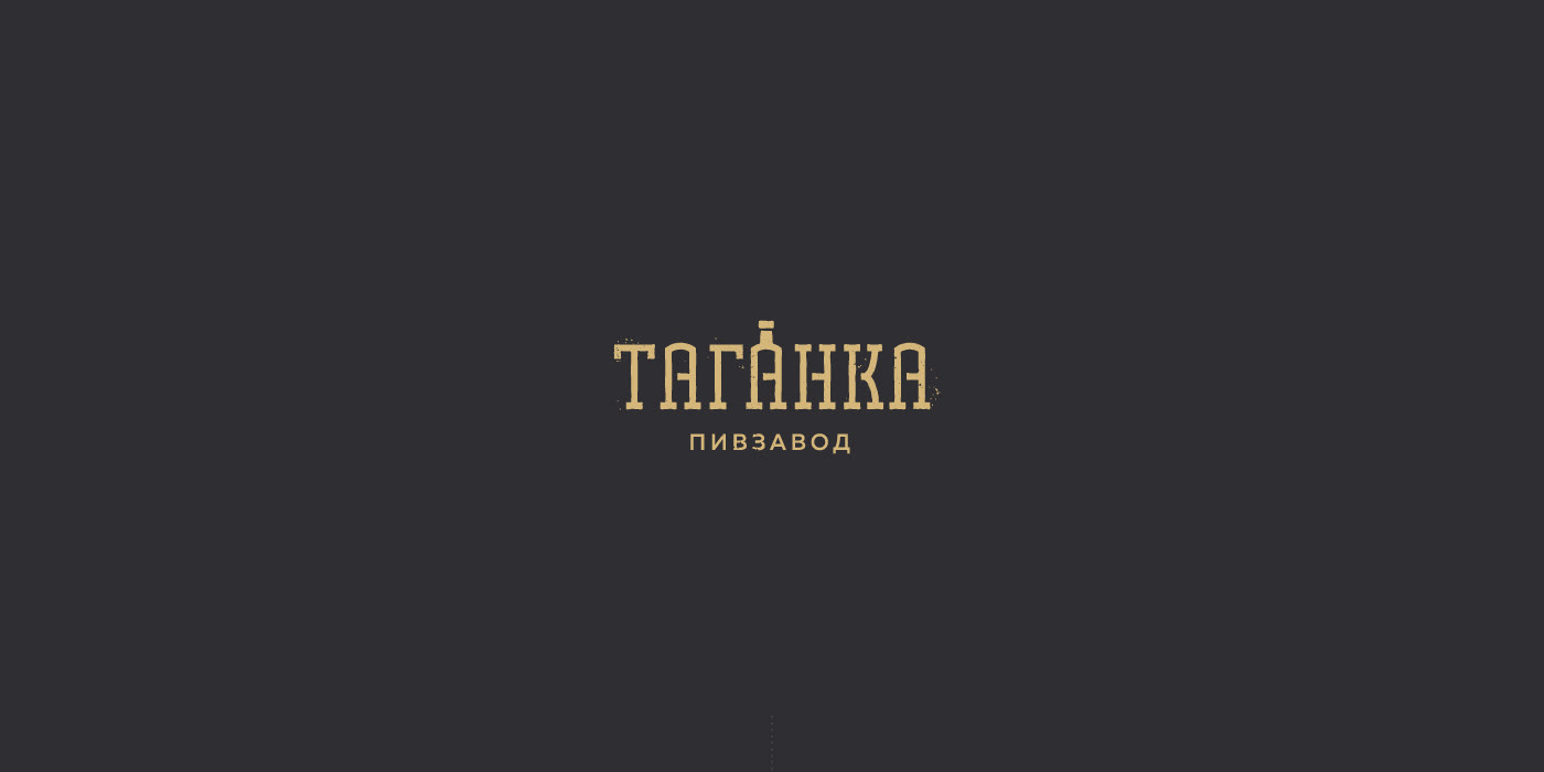
"Taganka" logo
Logo design for new brand of Tagansky brewery based in Moscow.
This project is interesting becouse of big number of ideas and sketches. Except the final version there were a lot of signs for every taste. Me were looking for the best and now we are sharing our work with you. Wish you will find it cool ;)
Task
Create logo for an old brewery based in historical place in Moscow. Conditions allowed us use naming from this list:
- Таганский пивоваренный завод (short "ТПЗ")
- Таганский пивзавод / Taganka brewery
- Таганка / Taganka
- Таганский пивоваренный завод (short "ТПЗ")
- Таганский пивзавод / Taganka brewery
- Таганка / Taganka
So we made many sketches for any these names. We paid attention as for field of brewing as for historical place that brewery based on.
1. Way
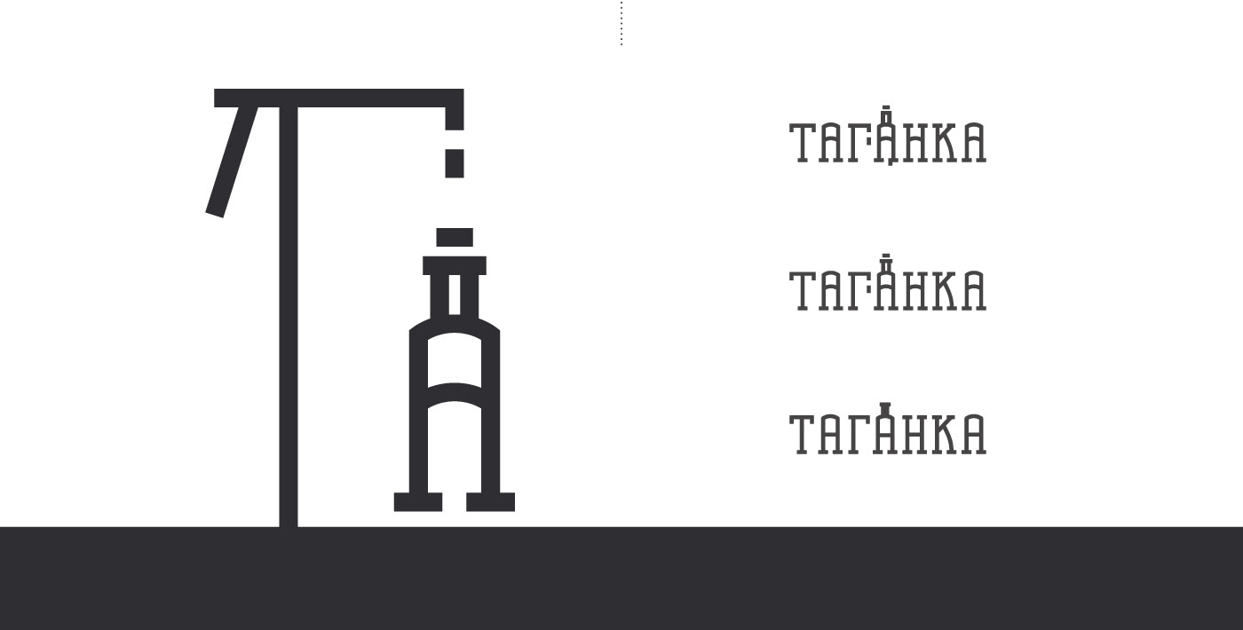
Word "Таганка" (Taganka) comes from «таган» (trivet) — this is a round metal stand under the vat on the legs. Not all people know about that and using this object in design could give a historical base that you need to recognize. It contributes a good memorization.
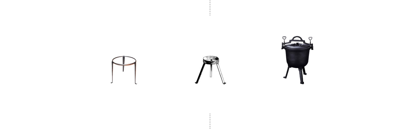
In this examples we tried to play with separete form of trivet.
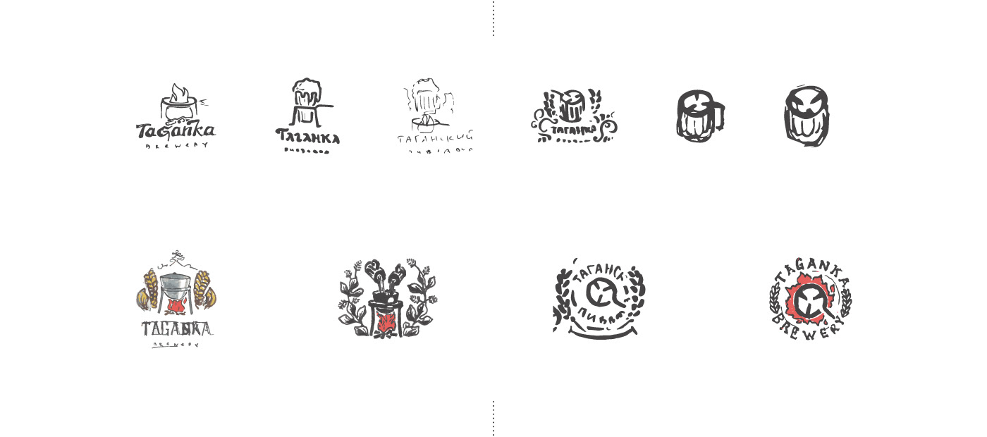
Then we tried to use trivet in letters. Decided to combine it with "G".

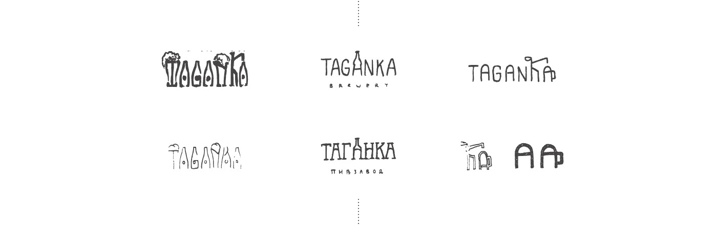
2. Lettering
Today we can see a lot of lettering logos. The name that drawn by any kind of brush is beauty. Also we took some signs of standart brewing theme. Malt for example.
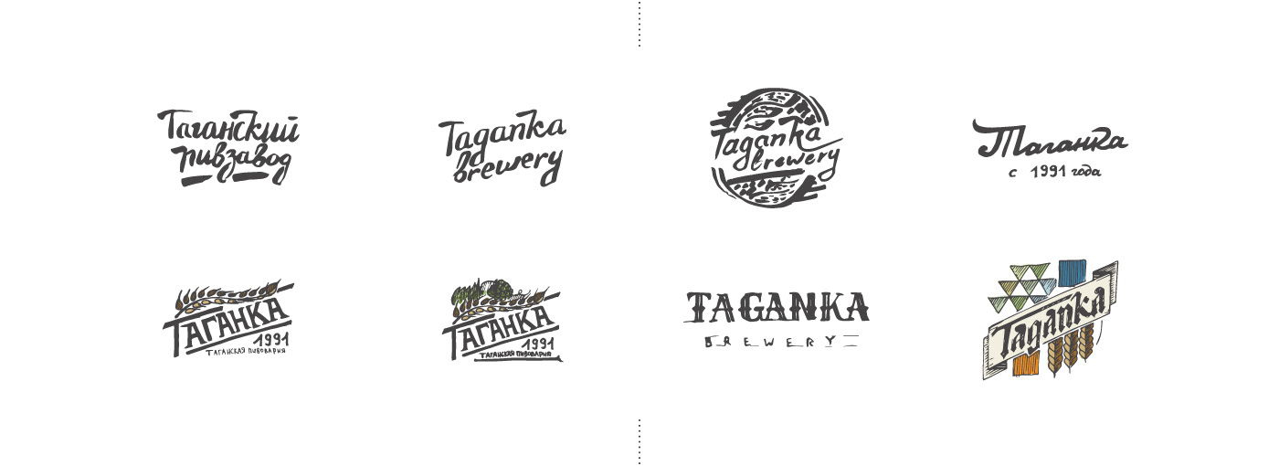
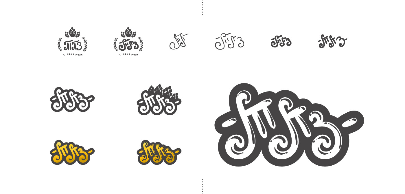
Stylization of abbreviation of brewery on cyrilic — ТПЗ (Taganka Brewing Plant)
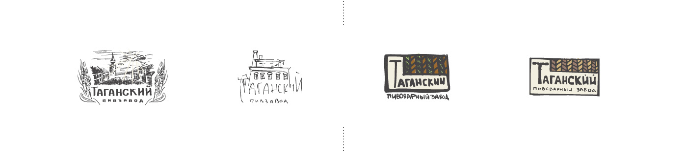
3. Location
Variant with using engrave style for images of historical place — as an example brewery itself or Taganskaya square. And another one where malt ears mean the roof of brewery.
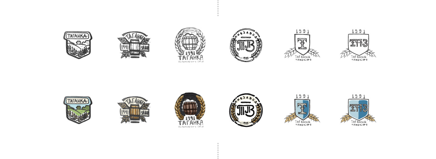
4. Emblems
The design of the sign with classic attributes. The landscape is just a metaphor of freedom and good mood. And beer kegs, ears, coats of arms...
Winner born
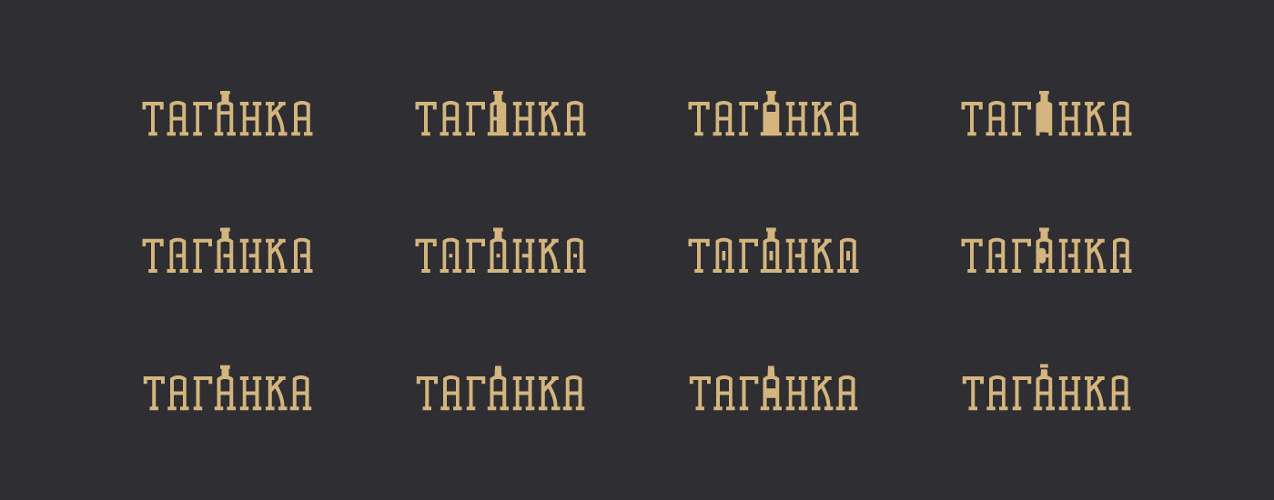
After many days and weeks (yeah, it was too long order) we suggested sketches with styling name itself. As in the case of trivet, we were looking for the similarity of the forms of letters and thematic subjects. In this case all beer utensils (glasses, bar cranes, bottles) were integrated. And these became lovely for customer.
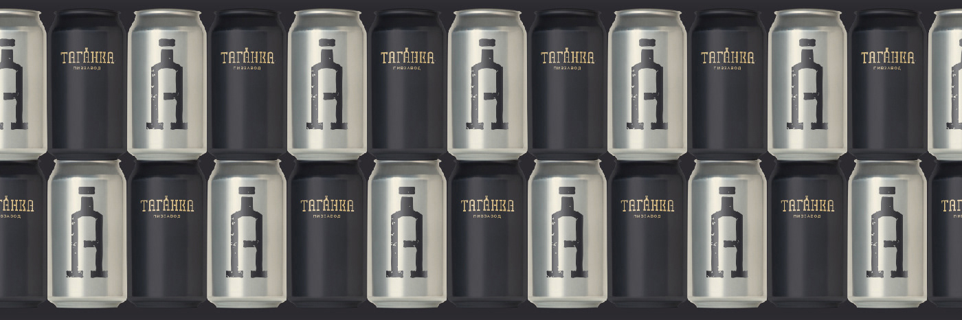
As a result, for the continuation of the work was chosen variant with the stylization of the central letter "A" to a bottle of beer. First, it combined the shape of a star also.
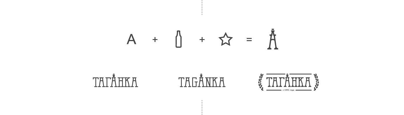
And we also thought to add bar tap. But logo construction was too difficult to understand and we decided to reject as from tap as from star sign too. We left only bottle formed letter "A".
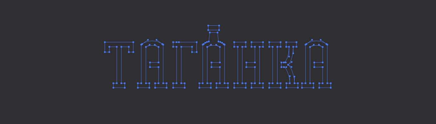
We just had to find the correct and recognizable shape of the bottle and add an emboss effect to it making thereby more expressive.
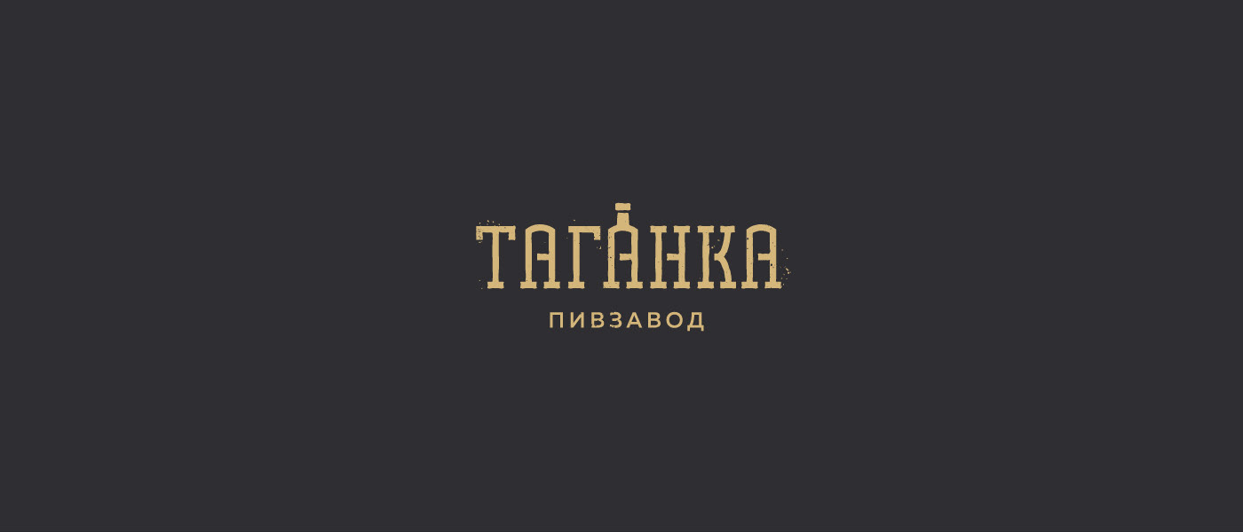
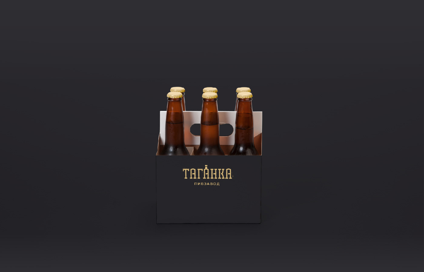
... aaand this is the final one
So that was another one journey. Thanks for watching
If you like it and want more stories like this please appreciate this project. Thanks ;)
Designers: